 At a time when we’re connected to more people and ideas than ever before, color trends allow us to express who we are and what we care about. Creating a custom, colorful home design means making many choices. Every inch of your interiors can make a statement when done right — from the layout of the space to the light fixtures, art, modern furniture, and accessories. In a modern space, there are hundreds of ways you can turn your house into a home. One area our interior designers focus on, year after year, is color schemes for your wall space.
Salt Lake City interior design trends have led many homeowners towards neutral colors like taupes, creams, or whites for several years. While these can be beautiful in the right space, brighter and more saturated tones are slowly increasing in popularity once again. In fact, paint color can significantly impact a room psychologically and aesthetically. Whichever color scheme you choose, you can make your space feel cozy, modern, contemporary, dramatic, or plain. It all depends on your choices.
What Color Should I Paint My Room?
Along with a color’s mental impact, the colors you pick can tie your space together or throw it off. That is one of the reasons many homeowners leaned towards less impactful colors. However, you can easily overcomplicate your color scheme decisions.
Don’t be scared of a bit of color in your home; our interior designers from our modern furniture store in Salt Lake City understand how to use color to your advantage. We are here to walk you through it! Below, find our go-to guide for selecting the right wall color for your home — and then learn how to let that choice guide the rest of your interior design.
How to Choose the Right Wall Color
One area that can make the biggest impact (and with the smallest price tag) is your wall color. Introducing a bolder wall color does more than fulfill a trend — it can also have a significant psychological and aesthetic impact on a room. Studies from the London Image Institute show a direct correlation between color and specific moods, such as red for excitement, strength, and love; blue for trust, peace, and loyalty; and purple for luxury, spirituality, and ambition. Whichever color you choose, know that it will immediately impact the feeling of your space. Cozy, modern, contemporary, dramatic, or calm? It all depends on your choices. Here’s how to get started:
Make A Plan
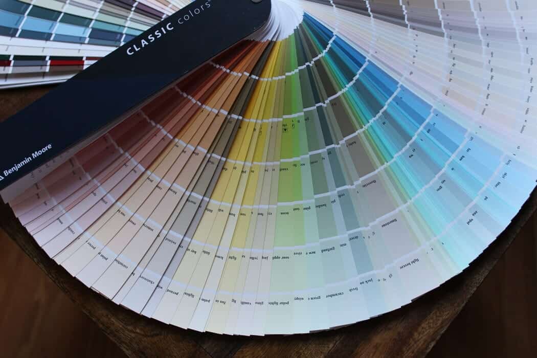
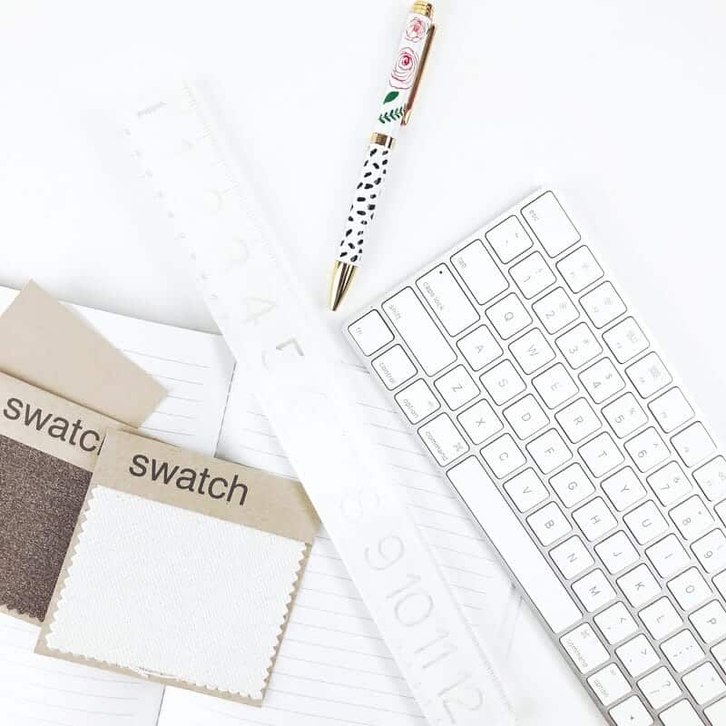 Before you head to your local paint shop, you must have a plan. Designing a space that fits your home requires considering what will go into the room. You must understand other elements in the area: existing furniture and decor, architectural elements, and even nearby rooms or spaces. Keep the rest of your home in mind throughout the color-swatching process; it’ll help you narrow your choices.
It will also help to envision your dream home. Keep in mind that changing up the color scheme of your home will dramatically affect the look and feel of your home. Fortunately, paint can always be swapped out, so have fun, and don’t be afraid of making mistakes.
Hue Matters More Than Shade
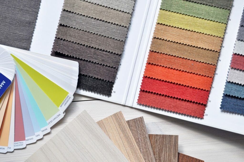 One of the secrets experienced interior designers understand is that a color’s hue is more critical than its shade. While picking out your paint color, choose the hue (e.g., red, white, blue, orange, or grey), then narrow it down to the specific shade (e.g., Robin’s egg, cobalt, navy, or sky).
While an overall hue like blue can convey similar emotions, different shades bring forth nuances that can speak directly to your unique space. Dark shades can make a room feel smaller and more intimate. They are ideal for cozy spaces like an office, powder room, or bedroom. Lighter shades expand the room, making it feel open and fresh. These are great for rooms with higher foot traffic, like a kitchen, living room, or a space with lots of natural light.
Get Inspired
The space will feel different depending on the color you choose for your walls.
Color can help create the desired mood in your home. Certain colors will evoke certain emotions in anyone who sees them. To make your bedroom feel calming, try using warm colors associated with peace and serenity, like yellow or pale blue. If you need more interior design inspiration, research what colors are trending. While trends aren’t everything regarding a lasting home design, they can introduce you to new and different colors you may not have considered.
For example, here are some of the latest trending colors to consider for your space:
Sunnyside Yellow
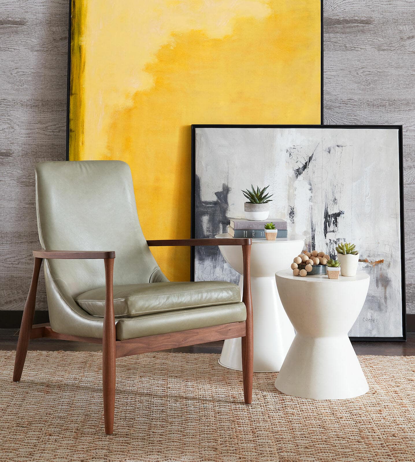
Yellow conveys creativity, happiness, and warmth. Bold, vibrant, and beautiful, a bright yellow will make you want to get up and dance. In place of neutrals, let your personality show through your wall colors and decorations. Create an inviting kitchen space or guest bedroom by painting your wall (or a portion of your wall) with this outstanding tone. Yellow is a great color when it comes to both interior and exterior design. It conveys creativity, happiness, warmth, and brightness.
In interior design, yellow can be a focal point or accent. For example, in a living room, you could add a yellow ottoman with some pillows to make it pop. You could add a small vase of yellow flowers in a bathroom to decorate the sink.
 Dusty Pink
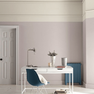
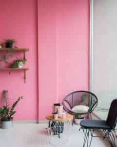
Compassion and sophistication come through with this muted pink tone. Not only is this a great shade for a master bedroom or bathroom, but it’s also an unexpected tone for a library or powder room. Dusty Pink is a great color for anyone who wants to add more of a touch of sophistication.
This tone is often found in rooms with very light-colored walls and furniture or in white or light-colored wall colors. Dusty Pink can be used as a very deep accent color in this color scheme, providing contrast against the lighter surroundings. This color also adds warmth to a predominantly cool-toned room, especially when paired with deep teal or turquoise blue shades.
Dusty Pink also pairs well with neutral-toned fabrics such as cream and beige. It can make for an elegant nursery wall paint color on its own if you want to go for something simple and clean. A lighter Dusty Pink can also make for a beautiful accent wall. Use this color in your living room, bedroom, or home office to accent furniture that would otherwise blend in.
Blue Breeze
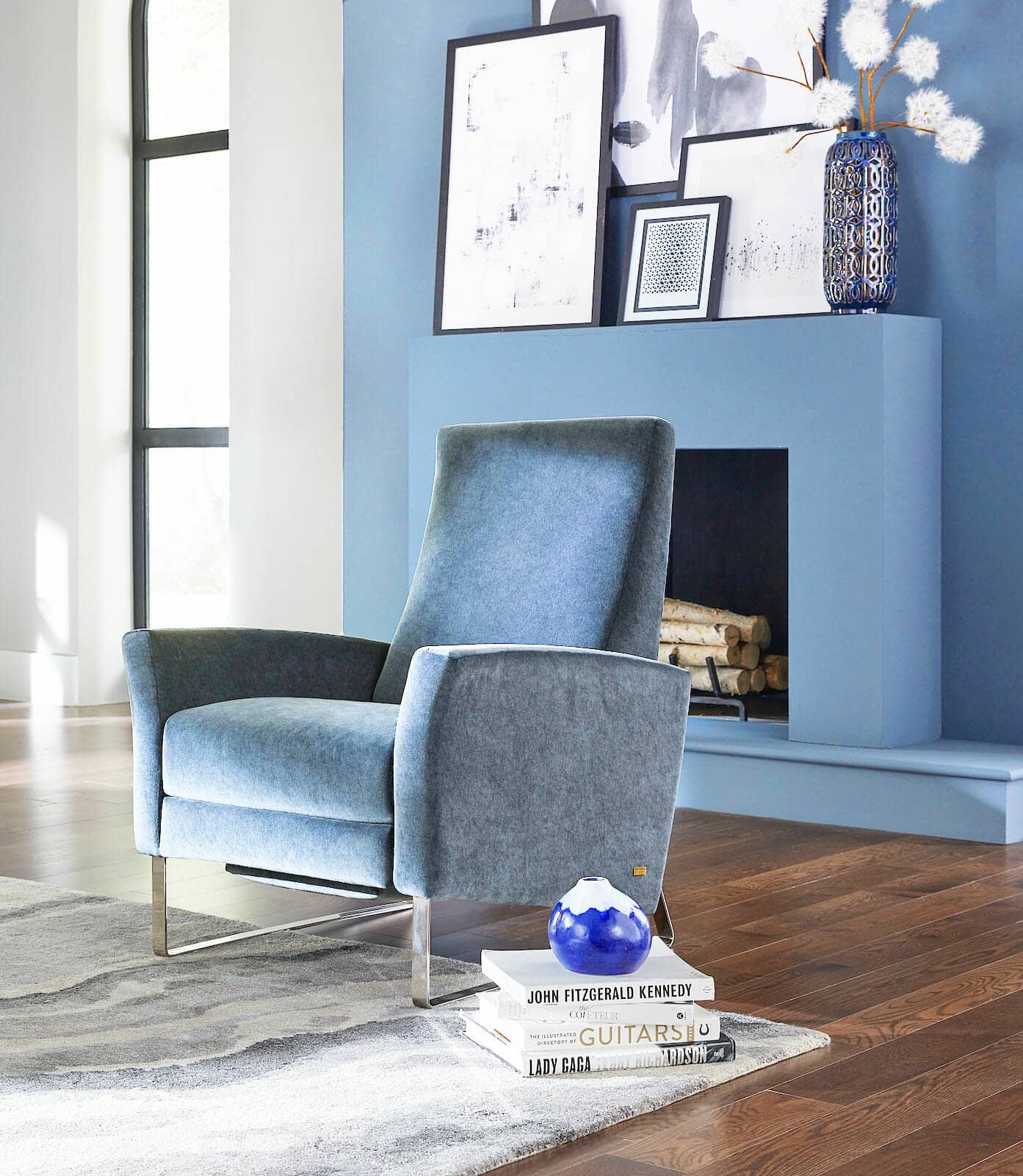
This shade is peaceful and serene for anyone looking to give their home a high-class aesthetic. Blue is a classic color for a bedroom, thanks to its ability to calm your mind and lift your spirits. This shade is excellent for anyone looking to give their home an elegant and tranquil feel. The blue tone reflects peace and tranquility, making it the perfect choice for the home décor.
Adding this cool color to the home puts more emphasis on cabinets and furniture. We think this shade is ideal for the bathroom, kitchen, or home office. Pair it with white accents and simple greenery for a delicate touch.
Green, Green, Green
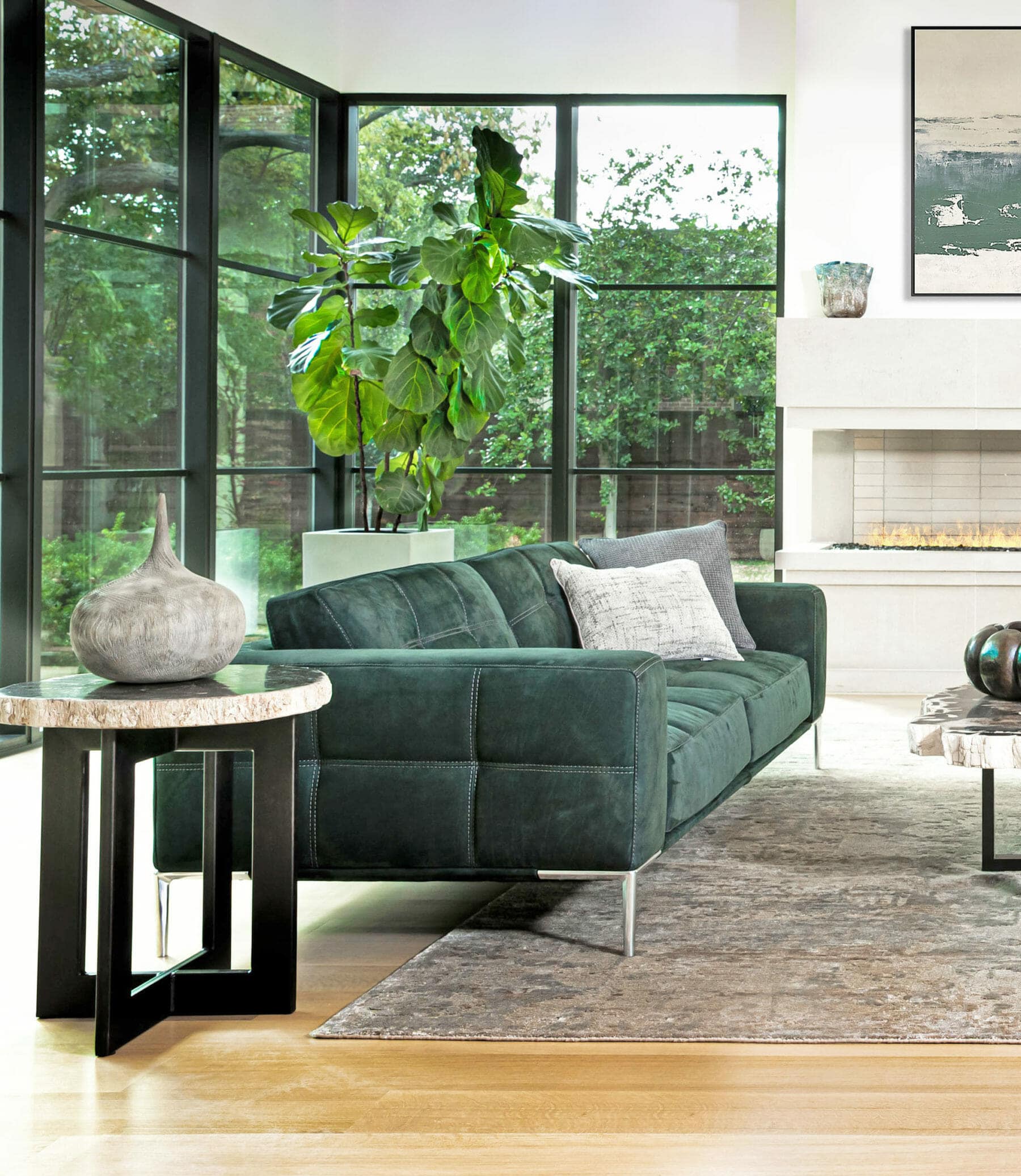
Bring nature inside with shades of green. From sage to seafoam, green is airy, whimsical, and has a restorative touch. Green is if you’ve been searching for a color to engage the senses and bring newfound freshness to your home. Earthy tones have the power to remind us of our connection with nature.
Smooth Gray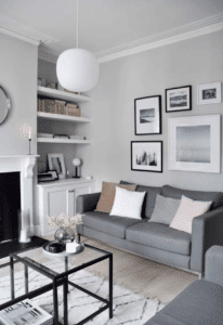
The best thing about gray is its versatility. If you’re in the process of updating your space, chances are you’ve noticed that the neutral shade is everywhere. Not only is gray a great option for wall colors, but it’s also perfect for furniture, cabinets, fireplaces, and everything in between. Gray can be overlapped and doesn’t clash easily with any other color in the spectrum, creating endless design possibilities. No wonder it’s one of the most popular colors for everything from wall paint to furniture.
Gray is a safe and versatile choice for any room in the house. It has been around for centuries and never seems out of style. It’s also easy to match with other colors when it comes time to refresh your decor. If you need a grounding color in your home, choose a smooth gray and enjoy it for years.
Pale Lavender
A soft lilac can be a fresh take on “neutral” as it pairs well with other colors. This whimsical shade is perfect practically anywhere and can be paired with bold modern furniture. Add this pale lilac to your dining room for a wonderfully subtle pop of color.
Choosing a single color to commit to may seem daunting, but it doesn’t have to be. Try this exercise: flip through several magazines and tear out the home images you feel drawn to. What colors or themes do these images have in common? Do you like soft, light, or darker, more saturated shades? Use this info to guide your search.
Try It Out
Always test paint colors in the space they’ll live before you decide on a color. Why? Lighting varies drastically from home to home and even from room to room. While you may love color in the paint store, you may find it looks very different in your own space. Plus, bringing a sample home lets you test the color with your furniture and decor.
If you are afraid of sampling the color on your wall, try putting it on a poster board and hanging it on the walls you intend to paint. This makes it easy to manipulate and swap out for different colors. Don’t forget: peek at the color several times throughout the day. Morning and evening light may change the color of your room.
Let Your Wall Color Guide The Rest Of Your Space
“Picking a color for a room should be a thoughtful process because colors can influence moods and feelings.” As mentioned by Interior Design Expert Lauren Nicole Shaw. You have to take into consideration that once you pick the perfect wall color, it has an impact on everything else that you put in your space. Let your wall color dictate what other colors you use in the room, picking paint colors for furniture and accents like lamps and rugs.
Once you settle on a color for your space, let it drive new design choices throughout the room. Switch up your furniture layout. Introduce a bold rug. Replace a tired light fixture. Here are some things to keep in mind when introducing new, colorful pieces to your freshly painted room:
Know The Difference Between Complementary And Analogous
When picking your color schemes, there are two ways you can go: complementary or analogous. Complementary color schemes involve colors that lie across from each other on the color wheel. These schemes tend to have a more calming effect on the mind and blend warm and cool tones.
Analogous colors, on the other hand, include colors that sit next to each other on the wheel. These tend to be more dramatic and stimulating and are usually either warm or cool. Read below to learn how to distinguish the temperature of your color choices.
Warm Tones
Warm tones include red, orange, and yellow, and variations of those three colors. These are the colors of fire, fall leaves, sunsets, and sunrises and are generally energizing, passionate, and positive.
Red and yellow are both primary colors, with orange falling in the middle (making it a secondary color), which means warm colors are all truly warm and aren’t created by combining warm and cool colors. Use warm colors in your designs to reflect passion, happiness, enthusiasm, and energy.
Cool Tones
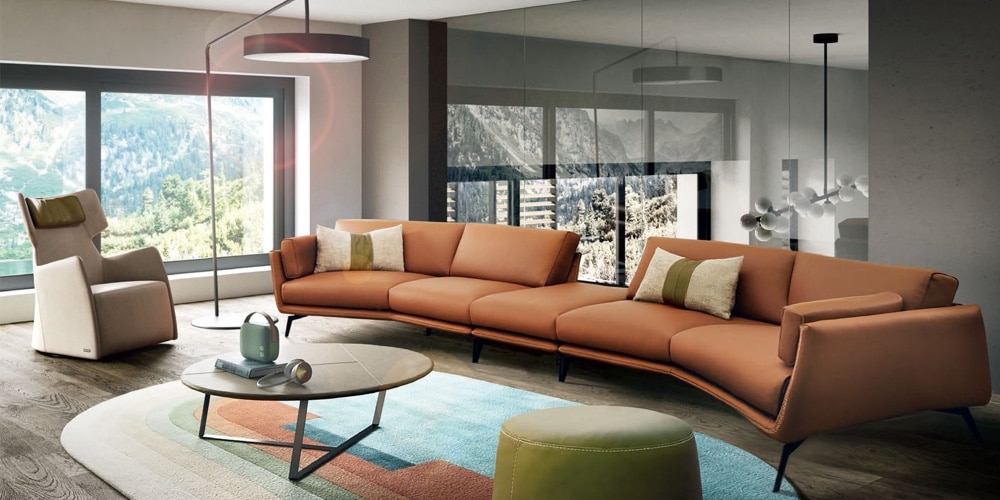
Cool colors, including green, blue, and purple, are often more subdued than warm colors. They are the colors of night, water, of nature and are usually calming, relaxing, and somewhat reserved. Blue is the only primary color within the cool spectrum, which means the other colors are created by combining blue with a warm color (yellow for green and red for purple).
Because of this, green takes on some of the attributes of yellow, and purple takes on some of the attributes of red. Use cool colors in your designs to give a sense of calm or professionalism.
Start Small (And Don’t Be Afraid To Go Slow)
One of the great things about color is that you don’t have to use a lot to make an impact. If a fresh wall color is enough of a color injection for you initially, slowly introduce more color over time. Consider adding small decorative items like pillows and vases before working on a new sofa or custom curtains. “Slow” design is smart for achieving long-lasting results you’ll love.
Use Neutrals Strategically
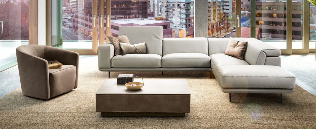
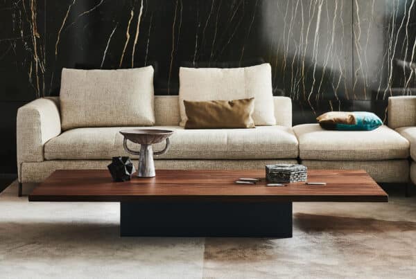
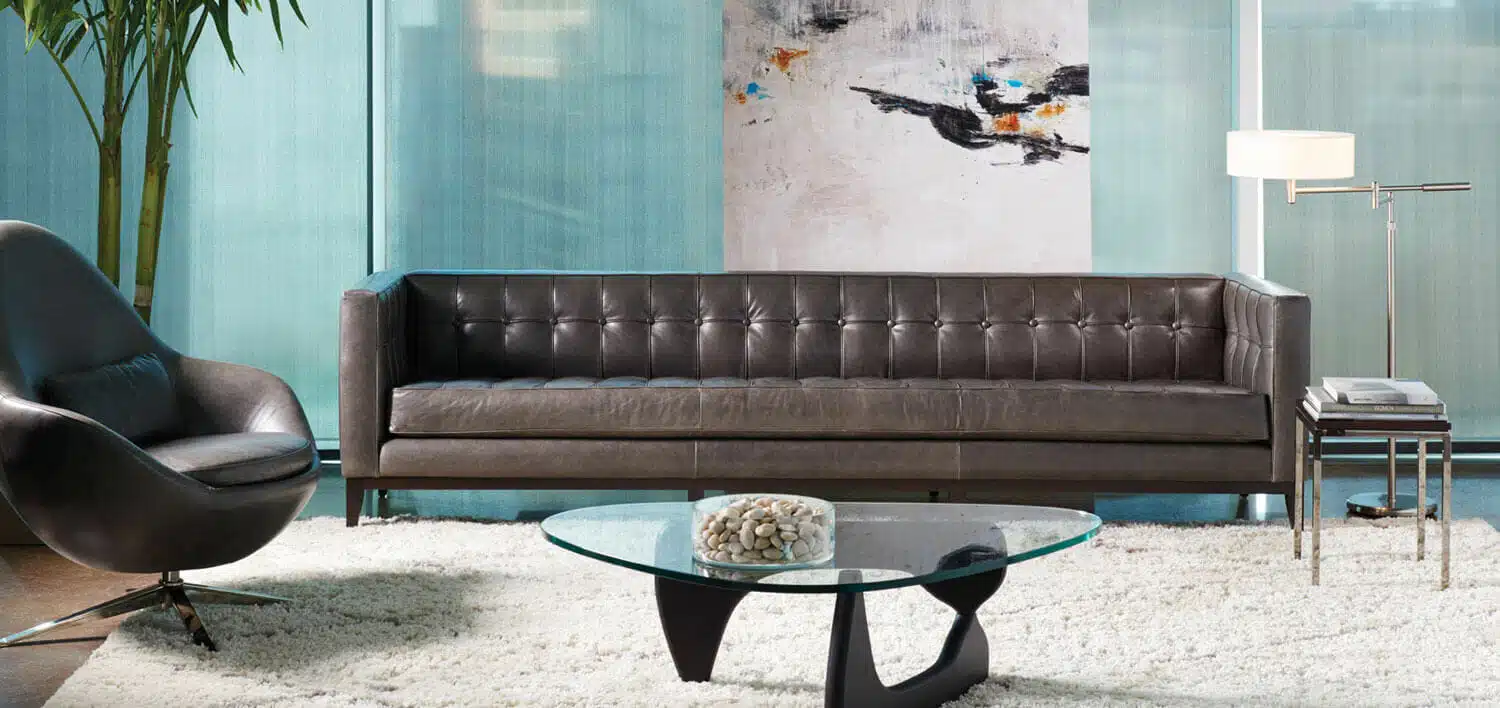
Neutral colors can be powerful tools in your design when paired with colorful furniture, decor, and walls. Warm or cool taupes, creams, and blacks give your eye a place to rest when scanning a colorful space. They also offer a sophisticated backdrop to help color pack a heavier punch into your design. When experimenting with color, it’s often a good idea to invest in timeless neutral pieces that can evolve with your space over time. For instance, think about using a neutral sofa as the backdrop of your colorful living room. Or, invest in high-quality neutral drapes or an area rug to give colorful chairs and artwork center stage.
Remember The 60-30-10 Rule
Last but certainly not least, learn and memorize the 60-30-10 rule — a timeless design tool every interior designer knows. It is a helpful guideline for determining how much of one color and how little of another should be used. The concept is meant to bring balance and works in tandem with the color wheel, so it can also be applied to your space
60% of your design should be the main color for your room.
Most likely, the 60% in a living room would be most of your walls, large accent pieces like area rugs, and perhaps a sofa. The 60% color anchors the space and is a backdrop for what comes next.
30% of your design should be the secondary color.
You’ll be using half as much of this color as your main color. So this could be draperies, accent chairs, bed linens, painted furniture, or even creating an accent wall. The secondary color supports the main color but is different enough to set them apart and give the room interest. The real fun comes with the accent color you’ll be adding next.
10% of your design should be the accent color.
This is your throw pillows, decorative accessories, and artwork for a living room. For a bedroom, this could be accent pillows on the bed, bedside table lamps, and nightstand candles. Your accent color can be pulled from artwork in the room or from a printed fabric on larger items.
The 60-30-10 rule is a bit of a cheat sheet for novice DIY designers. It can make choosing color simple and help you achieve balance in decorating.
Get Colorful with Help From our Interior Designers
A fresh color can do wonders for helping you see your space in a totally new light. And if you’re looking for a professional opinion, chat with our interior designer team at San Francisco Design. Our modern furniture stores in Salt Lake City & Park City, UT, have the fresh, trendy pieces you need to revitalize your space after a fresh coat of paint. Contact us or stop by a showroom today to see what’s new.

